

By Ganapathi Devappa,
Big Data analysis
Human eyes are known to be the best recognizers of patterns. So instead of writing complex algorithms to recognize patterns in data, the data can be presented to human eyes in visual form. The eyes can then detect the patterns in seconds or minutes and make meaning out of the data. Thus data visualization has become an important part of big data analytics.
We have talked about storing and processing of Big Data but what is most important is what out come is expected from data. Traditionally data has been used to describe what happened and correlated the events of the past. It was not used to prescribe what one needs to do next or how one needs to use the data as there wasn’t enough data to do that. Many of the forecasting techniques came with lot of constraints and assumptions that were not very practical.
However with the companies having large amount of data now, there is enough data now to remove the constraints associated with predictions and forecasting. Instead of saying this is likely to happen, with big data you can say that this is going to happen. This amount of accuracy allows one to not only predict and also to prescribe a set of actions to take. For example, based on the customer complaints over the last 5 years, the company may decide to continue with the store they had planned to close due to losses but with different focus.
Traditional visualization techniques
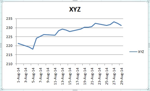
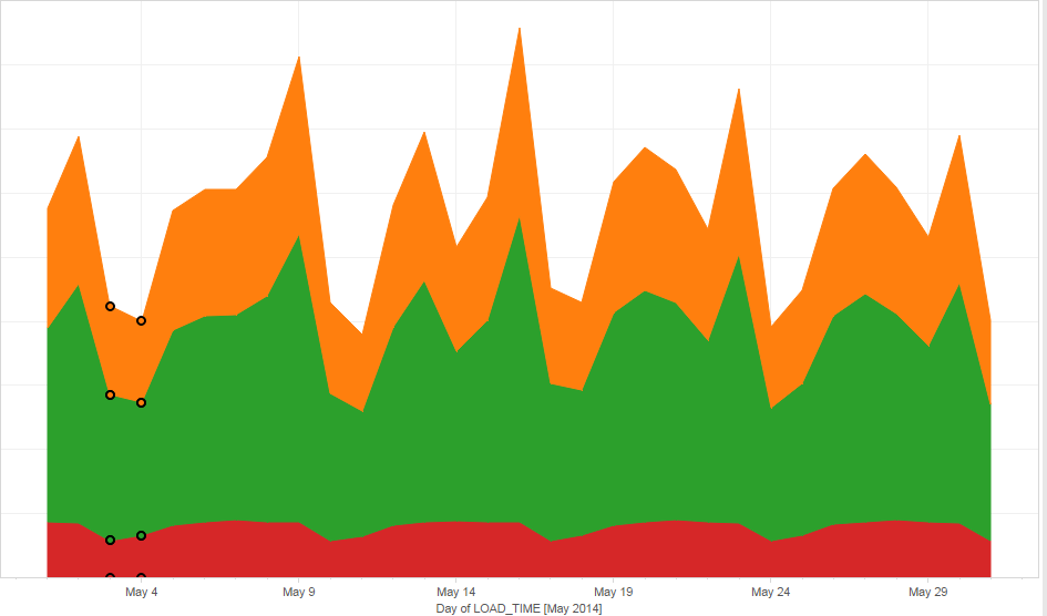
Traditional visualization techniques have been to use pie charts, bar graphs or line charts to describe the data and report on the data. These methods do not work very well with large amount of data. But still these can be used to represent data. For example, the line chart below represents the last one month stock chart for the stock xyz.
Big data and visualization
One may ask why visualize when you can write complex algorithms to figure out patterns in data. Human eyes are known to be the best recognizers of patterns. The pattern recognitions that may take months for a programmer to write may take human eyes few seconds to recognize.
The purpose of big data visualization is to use all of the data and present it to the eyes so that eyes can figure out the patterns. The idea is not only to describe and report but to explore and predict based on the data. It is also possible to use all of the data and not only a subset of data for visualization and decision making. Visualization may help figure out hidden anomalies in data and identify patterns that are actionable.
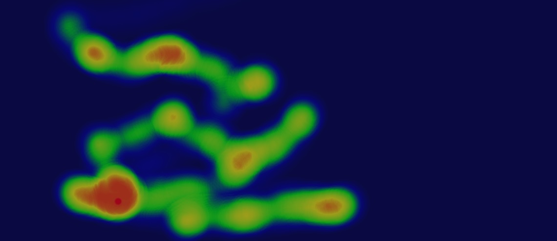
For example, the image above shows the heat map for clicks on a website. It shows how visitors to a website move their mouse on the site and where they click. The colors red, green and blue represent frequency of moves/clicks. Above image is superimposed on the website page to give a clear picture of actual behavior of the potential customers on the site. Lot of research has been done on this subject and many SEO sites provide findings to improve the heatmap to your expected customer behavior.
Data Artisan
New term data artisan has been coined to indicate people who do the visualization of data. These are data scientists who analyze the data by representing it in some visual form. They may experiment with the data to figure out how best to represent in a visual form. They also have to remove any noise in the data. These two activities will probably go hand in hand as they represent data in different forms, they will find new noises in data that can be removed. Once they have a representation of data, they also have to find the outcomes from data that prescribe the new course for the organization. They have to start at the strategic levels and provide the inputs to the CxO so that actions can be initiated at the organization level. Some people say that data scientist needs well versed with statistics and maths where as data artisan needs to be artistic to visually represent data.
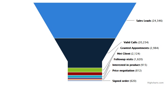
Below is a visualization of sales funnel for an organization represented using High charts. This gives a clear picture of how the sales team is doing.
Geospatial visualization
With the proliferation of GPS enabled phones, it has become possible to locate your customers on the map. With many improvements in the map software, you can use the data to pinpoint the location of your customers and make many analysis and decisions based on this data that was not possible earlier.
A car manufacturer analyzed the distance of the customers from the dealerships where they purchased the vehicles from. They couldn’t find a very good correlation. Then they tried the travel distance and still couldn’t find a correlation. That is there were many customers who bought car from a dealership that was 20 miles away and took them 20 minutes reach instead of another one that was 10 miles away and took 15 minutes to reach. When they plotted the data on a map. The map is roughly as below.
The blue stars on the map represented the customers who were nearer (in both distance and time) to Dealer 2 but were still doing business with Dealer 1.
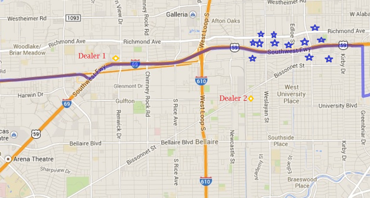
Can you prescribe a solution for new dealerships based on this? It is easy to figure out from this map that the dealerships that were close to a high way found more customers, even if there was another dealership that was nearer! Travel convenience mattered more than the distance or time and this couldn’t be put in numbers. This insight allowed them to plan their dealership locations better for targeted customer localities.
All solutions are not this simple and it does take lot of trial and errors by the data scientists and data artisans to find suitable representation of data based on the situation.
Tools for Visualization
There have been many tools earlier like Business Objects (now owned by SAP AG), SAS, IBM SPSS etc that are used for BI and visualization. But these have been difficult to use for Big data due to the large amount of data to handle. Then came tools like Tableau and Domo that performed well even with large amount of data and allowed analysts to view data in which ever way they want. These tools have increased the power of Bigdata. Here is a visualization using Tableau:
Interactive graphs
With the coming of Java script graphs, the visualization has become much better as now the charts and graphs can be interactive. You can add or remove data dynamically or change the type of chart, zoom in or zoom out to get different perspectives of data.
Just a few days back I had interaction with the founder of Fusion Charts who introduced Fusion Charts when he was 17. Now Fusion charts has become a standard for Java Script charts for corporates. Other charts like High Charts and Am Charts also provide good alternatives. My favorite is Am Charts as it is very easy to use and provides lot of options for interaction.
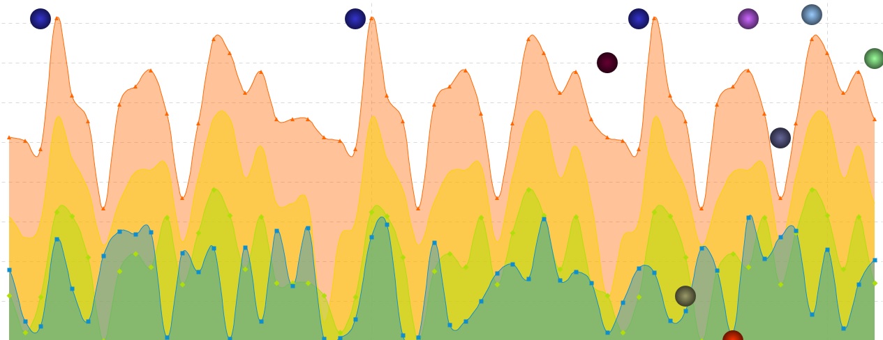
The diagram at the beginning of the blog represents data for retail shops super imposed with outliers. Here I present the same as an interactive chart. Try moving the mouse over various points, zoom in using the selector at the top or mouse. You can also hide some of the graphs by selecting/deselecting them using the legend at the bottom of the chart. Courtesy of Amcharts, even blogs can now become interactive.
Visualization by sound?
Recently I was watching a TV serial with my whole family. An actor we knew from an old serial came in a disguise as a character in this serial. We couldn’ t recognize him but when he spoke, we immediately recognized him from his voice. I had read some where that ears can recognize a person better than the eyes and this proved the point. Then I thought can we use sound to recognize patterns in big data? May be the data can be converted to sound and ears can recognize the anomalies in data. It is possible that animals with more sensitive ears may be used for this purpose. I couldn’t find much on the internet as the search engines always found lot of matches for visualizing sound rather than using sound for visualization. I am sure some one in some university is doing research on this. Though eyes can look at only one video at a time, ears can listen to multiple sounds and discern at the same time. Also ears can ignore noise more easily than the eyes.
Conclusion
Data visualization is a very powerful technique to gain valuable insight into data. Used with big data it allows one to prescribe outcomes based on the patterns in data. Human eyes are the best pattern recognizers and this can be used by companies to utilize their data better. Organizations still need to figure out if they are watching through the rear view mirror or lighting the path in front. Big Data has certainly created a weapon that the organizations with more data can use against organizations that don’t have enough data.
About the Author

Ganapathi is an expert in data and databases. He has been managing database projects for many years and now is consulting clients on Big Data implementations. He is a Cloudera certified Hadoop administrator and also a Sybase certified database administrator. He has worked with clients in US, UK, Australia, Japan and India on many large projects. He has helped in implementing large database projects in Sybase, Oracle, Informix, DB2, MySQL and recently SAPHANA. He has been using big data technologies like Apache Hadoop and SAP HANA and has been providing strategies for dealing with large databases and performance issues and helping in setting up big data clusters. He is based out of Bangalore, India. He can be reached at ganapathid@spideropsnet.com.
Beautifully presented topic. Its presenting the data in this type of media